I have this thought running around in my head that I can’t quite shake yet. It is “So that actually happened”.
You would be forgiven for thinking this is odd (even for me), but you see, on Friday I had the honour of being a part of an incredible lineup for Responsive Day Out 2 – The Squishening in Brighton.
And it was AWESOME!
For those of you reading this who don’t know about Responsive Day Out. It is a one day conference held at The Corn Exchange in Brighton and focusses solely on the subject of Responsive Web Design. Last year saw the first Responsive Day Out happen and it had an absolutely amazing lineup of very talented people. Unsurprisingly, tickets sold out so quickly I wasn’t able to go. This year I knew the lineup would once again be full of very talented people whose work I admire, so to be invited to speak was kind of mind blowing.
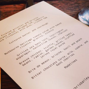
Menu from Speakers Dinner
Tickets for this year sold out before I even realised they had gone on sale and I was told that there was approximately 350 people there on the day. So its pretty safe to say that this is a very popular, well respected conference with a stirling reputation. No pressure then… ~ grin!
The Whole Experience
The speakers dinner the night before kicked everything off and set the tone for an amazing couple of days. We were all whisked away to Artists Residence for an 8 course meal from chef Chris Bailey. Which, I have to say, was the best food I’ve ever eaten! (apologies to anyone who’s house or restaurant I’ve been to dinner at, but it really was). Definitely not a bad way to start the conference experience.
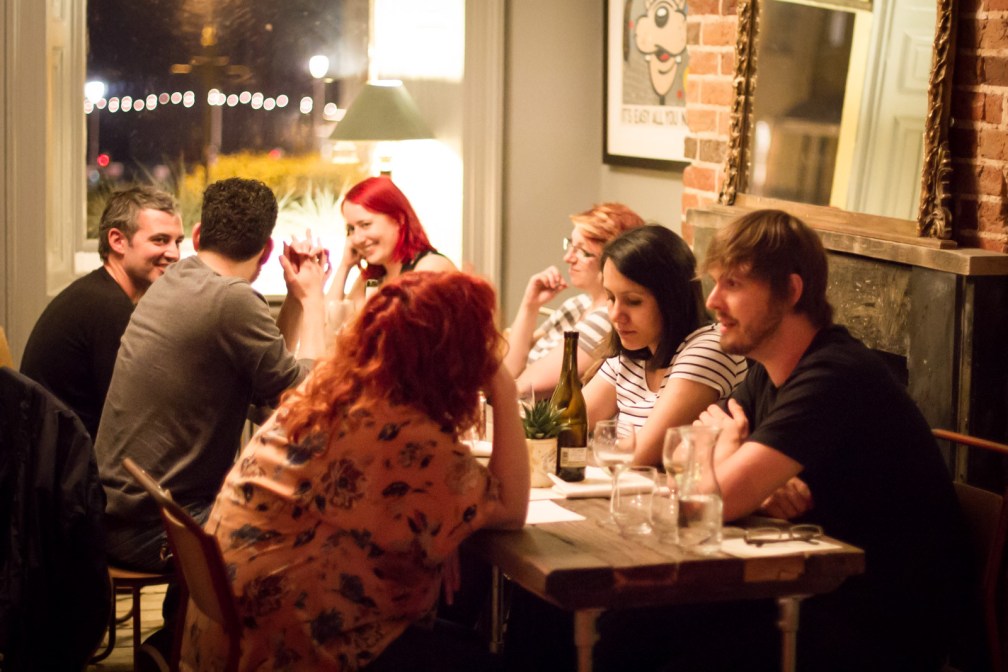
One of two tables at the speakers dinner the night before – Photo by Marc Thiele
The day itself was, for me, a mixture of both nerves and awesome-ness. I wasn’t on until the afternoon so I had most of the day to try enjoy myself and not get too nervous (fat chance on the second – I don’t think I’ll ever truly conquer the nerves). But I did really enjoy myself still because all of the speakers in the lineup were incredibly inspiring and did a fantastic job. I loved the format of 3 x 20 minute speaking slots and then a Q&A per session. It meant that the day was fast paced but still very relaxed and informal. Exactly the sort of event I enjoy the most!
There was a great balance of topics, from processes and systems, to case studies (I ALWAYS love to see these – in fact, keep an eye on Shropgeek in the coming months for an announcement about an idea around this sort of thing), to what the future could bring and how we can affect that future.
The Sessions
I won’t give a complete outline of each individual talk because actually Ida Aalan has done a superb job of that over here. Not only did she manage to sum up my talk far more succinctly than I did in my 20 minute slot but, even more impressively, she actually tweeted me the link to her summary as I walked off stage! A-MAZING!!
I did however, make sure that I had at least one takeaway from every talk that I will share here.
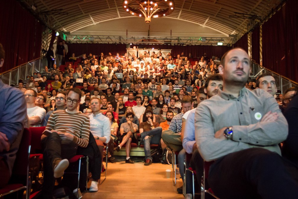
Funny, the audience doesn’t look anywhere near as big or intimidating now… ~ grin! – Photo by Marc Thiele
Session 1
The first morning session was Stephen (@stephenhay), Sally (@sjenkinson) and Ida (@idaaa). Stephen talked about sculpting text as a design process and showed examples of working within the browser. This is an approach to design that I hadn’t really thought about before and I really enjoyed the demonstrations so will be doing so on my next project. Stephen also put my mind at rest as I was a bit worried that my slides would lower the tone of the day somewhat (some are purposefully very ugly) but as soon as he opened the conference with animated comic sans and possibly the best seagull drawing I’ve ever seen, I knew my slides would be fine! ~ grin!
Sally, talked about being responsive meaning more than just screen sizes. Being a geek, I especially enjoyed the tie-ins with Batman and Spiderman and the message of “With great power comes great responsibility”. Although my geekdom was out classed that night at dinner when it was pointed out the Spiderman slide was not first edition because only the illustrations from the first edition Spiderman ever survived.
Ida provided a fantastic case study for the Norwegian Cancer Society, looking at how they used workshops to determine the core content and ways to that content. She also included lots of statistics since the new website had been live which was really valuable information and something we don’t get to see that often.
There was also an interesting debate about who would win in a fight, Batman or Boba Fett? to emerge during the Q&A. I’m afraid my money would be firmly on Boba Fett! ~ grin!
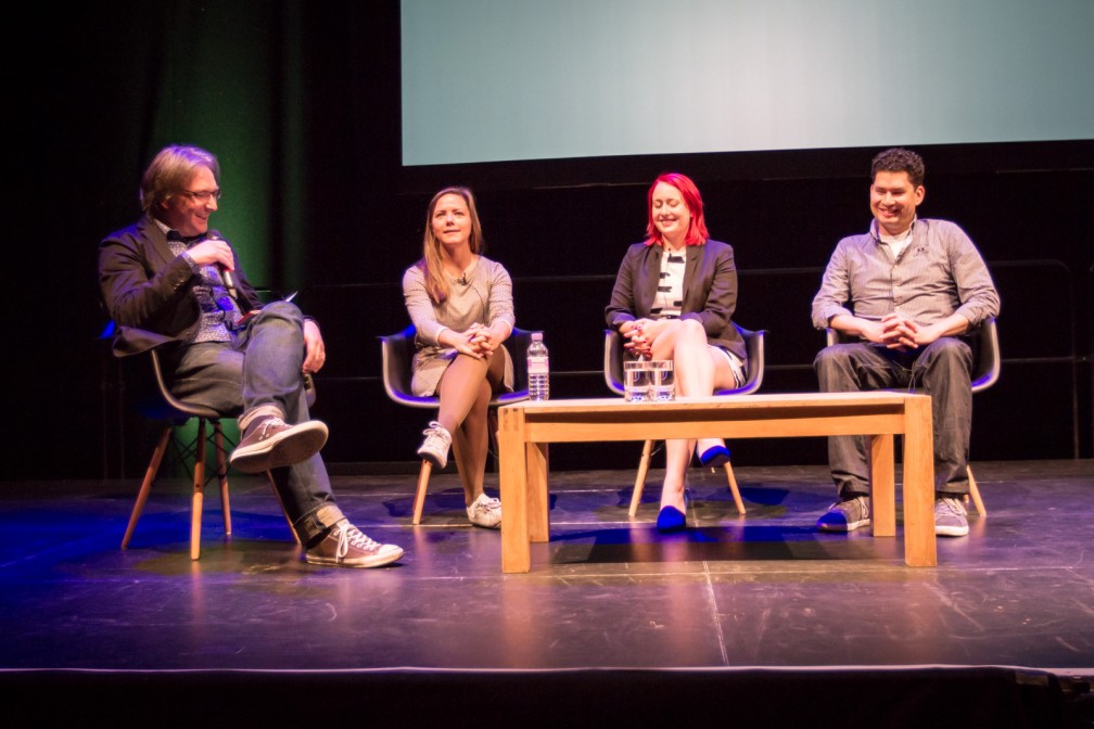
The first Q&A Session – photo by Marc Thiele
Session 2
The second session was Rachel Andrew (@rachelandrew), Dan Donald (@hereinthehive) and Inayaili de León (@yaili). Rachel talked about the CSS Grid Layout module, which looks very exciting. Considering some of the issues I’ve had in the past with content hierarchy (some of which I mentioned in my talk), I can’t wait for this to be implemented more fully. I’m especially excited to see Rachel speak at (R)Evolution in September now too!
Dan talking about element queries – Photo by Marc Thiele
Dan has this [awesome]awesome[/awesome] idea about element queries and how they could possibly be implemented which he shared with us. I thought this was an extremely exciting idea, especially as modular CSS is already becoming more common.
And Yaili’s case study was all about making the Ubuntu website responsive without allowing anything on the desktop version to change. This was fantatsic as making something that already exists responsive without making any changes to content or HTML, so that those people using the desktop site wouldn’t notice any difference, is a huge challenge!
Session 3
After a nice long lunch (I really appreciate that in a conference as it gives you time to meet people and explore the city you are in a little – or it does usually. This time I chose not to do that and instead focus on not panicking about my talk! ~ grin!) it was time for session 3 which was Oliver Richenstein (@richenstein), me and Stephanie Rieger (@stephanierieger).
Having been sat with Oliver the night before at the speaker dinner, I knew his talk was going to be great. I confess that by this point I was in a downward spiral of “Don’t panic” as I was up next though, so didn’t take a lot in. I did agree with his point in the Q&A about not having completely unrelated content in a second column of a page though. The content should be related by more than just proximity.
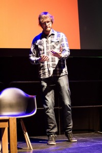
My bit
Thanks to @sjenkinson for taking this. Possibly the best slide I’ve ever created! ~ grin!
For my talk, I chose to do something a little out of my comfort zone (I mean more so than the actual speaking in front of 100’s of people thing) and talk about some of the mistakes I have made when trying to figure out a new project workflow for responsive design, that suits both me and my clients. I have uploaded my slides now which you can view here, although the animated gifs didn’t convert 😦
Considering I was very nervous by the time the afternoon session started, it went fantastically well. There was a single moment when I was on stage and everyone stood up when I asked them to, that I knew this would go well. Everyone laughed at the right moments (cos thats always a worry if your trying to be funny and no one thinks you are!) and I walked off stage feeling very happy and proud of myself.
The audio from all talks are now online here, you can have a listen to my session and Q&A below:
The takeaway from my session? Remember to tell people to sit down again! ~ grin!
After me was Stephanie, who delivered quite a technical talk on media queries. This looked fantastic but again I confess that I was still in the “Oh my god I actually did it” phase after my talk for part of it. The idea of using native components rather than always trying to style things differently did really resonate with me though. I’d really like to see that adopted in future.

This one is me (in case you didn’t know ), although I really do look like a midget from this angle! ~ grin! – Photo by Marc Thiele
The final session
The final session of the day was all about Ethan. Well he is the guy that gave responsive web design its name after all. He did a fantastic talk about laziness in the time of responsive design. He showed us that laziness is not always about bad practice or being sloppy but about approaching things more practically and that progressive enhancement is the laziest way to build the modern web (yet it is what we all strive for). It was a truly inspiring talk and it totally rocked when he mentioned everyone’s talk in turn, and described them all in such an amazing way. He came across as confidant, with an easy mannerism and generally, just a really nice guy. I hope that one day I can deliver talks as well.
My take away from Ethan’s talk was to stop feeling guilty that I can’t keep up with every aspect of the industry and, to never feel like I’m cheating when using “nth-child” ever again! ~ grin!
Overall, the whole experience was just awesome. At the end of the day, I had learnt alot and left the conference feeling truly inspired (and also very relieved that my talk had gone well). It was fantastic to see people I often only see at conferences and to meet so many new people, including the other speakers.
This really was one of the best conferences I have had the pleasure of attending (obviously except for my own – cue shameless plug for (R)Evolution ~ grin!) and I believe it definitely cemented its reputation ready for next year – if they decide to do another (which I really hope they do).
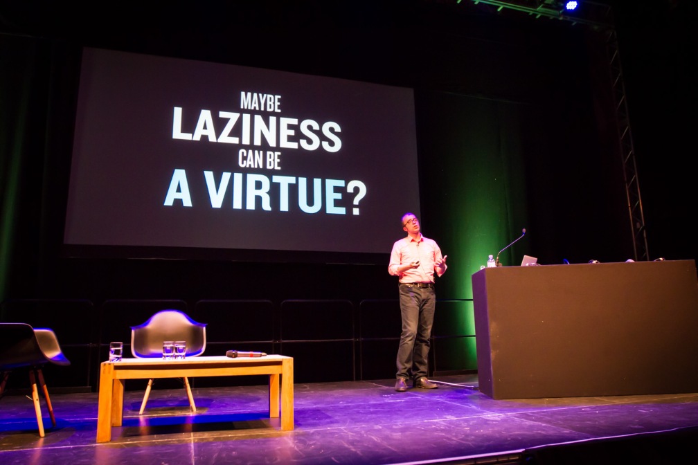
Ethan finishing the day – Photo by Marc Thiele
Posing…
This was also my first visit to Brighton, which I absolutely loved! And because the meal I had after the conference was amazing too, I left on Saturday with the distinct impression that Brighton knows good food! I will definitely be back in September for DConstruct, I already have my ticket and I look forward to attending Responsive Day Out 3 too (although I will have to be quick to get a ticket!). Maybe next time I’ll even be brave enough to go on the big wheel (although probably not).
A few thank you’s
I’d like to say a huge thank you to Jeremy Keith and his team for inviting me to speak. It was genuinely an honour and a pleasure to be able to contribute to such a great day.
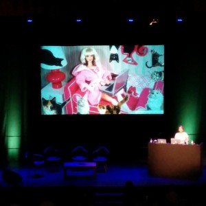
And of course, thank you to everybody for the very kind words about my talk afterwards. I’m really chuffed that you enjoyed it and it means a lot that you took the time to tell / tweet me to say so. I’m also rather pleased with the comments about my slides. I can’t tell you how many hours it took me to Photoshop those cats into one of them (actually, if you saw my facebook status a few days earlier you would know it wasn’t long at all! ~ grin!).
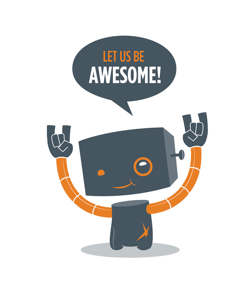
Oh, and you may have noticed the latest addition to “Team Kirsty” in my slides – referred to as “Robot Dude”. He was newly created especially for this talk by the very talented @stina_jones and now needs a name. Any ideas? 🙂
Still want to know more about the day?
Here’s some useful links which I will update as I see people post things:
- The official website
- The schedule for the day
- All photos of the day by Marc Thiele
- The audio from all talks and Q&As
- Ida Aalan’s Notes from the day
- My slides
See you all at the next conference! 🙂
 Kirsty Burgoine - WordPress / Frontend Developer